ORCA®
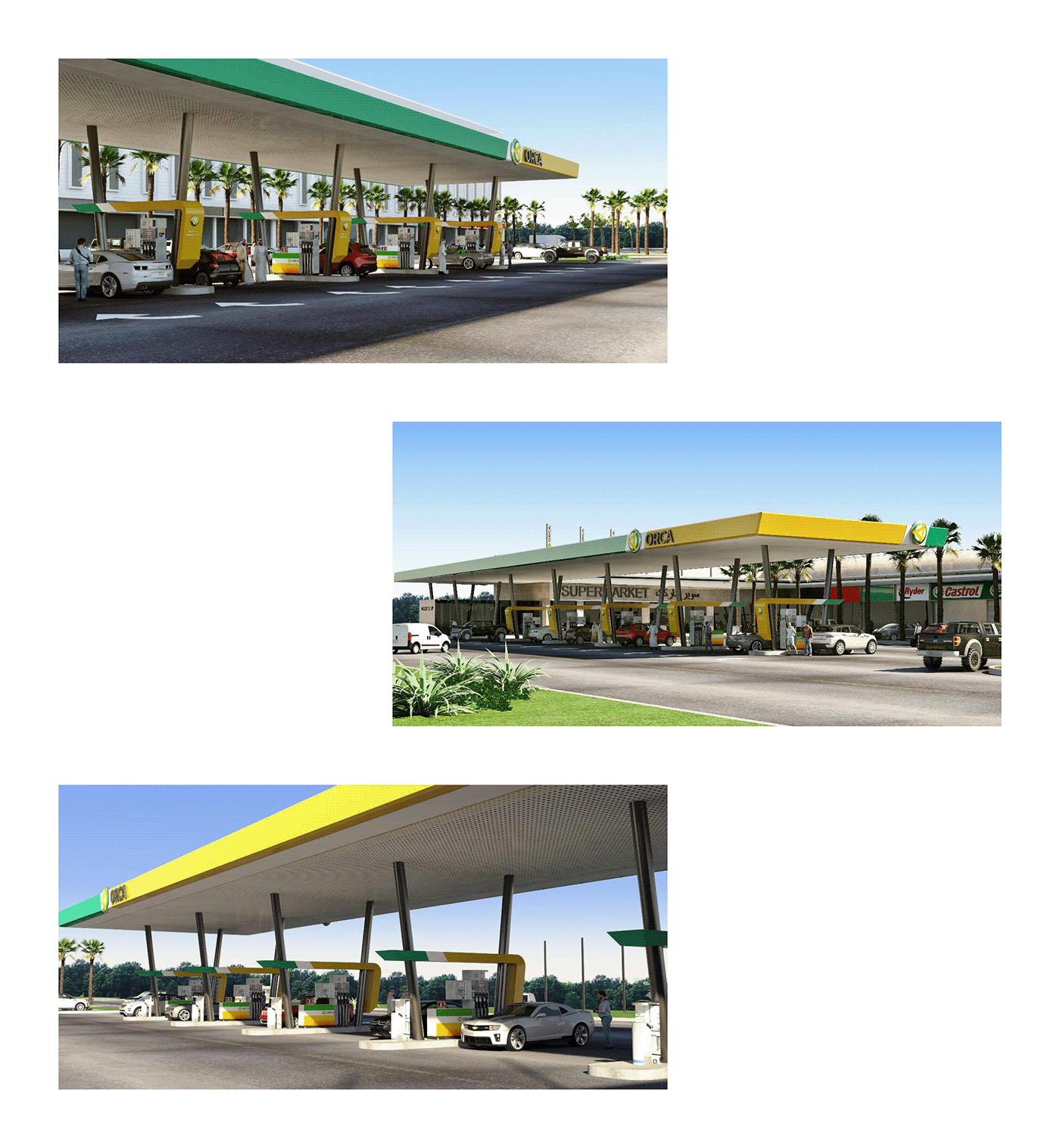
A Saudi company that works in the field of oil and road passenger services with a wide network of stations equipped with the best comfort possibilities in which the traveler’s different needs are available such as housing, eating, drinking places, cafes, car maintenance, and tire change. In addition to this the mosque, food supply centers, and ATMs.
KSA — August 2019

Branding Challenges.
- The visual appearance of the entire network should be audited and studied the visualization of the target audience.
- Create a logo that could be registered as a global trademark with no copyright issues.
- Increase brand awareness and differentiate from the competition.
- Create a visual identity that looks appealing to the middle east clients.
- Create a logo that could be registered as a global trademark with no copyright issues.
- Increase brand awareness and differentiate from the competition.
- Create a visual identity that looks appealing to the middle east clients.
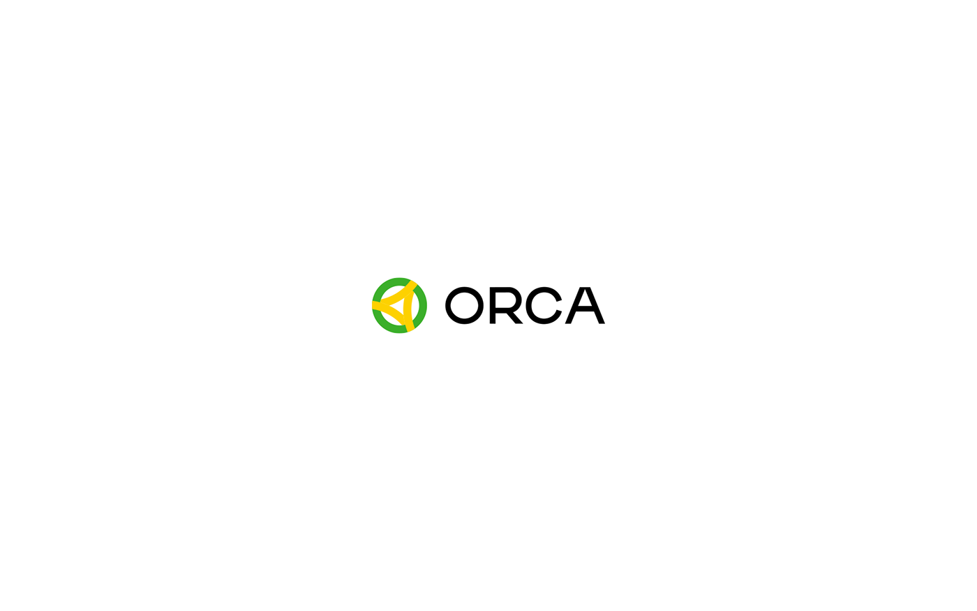
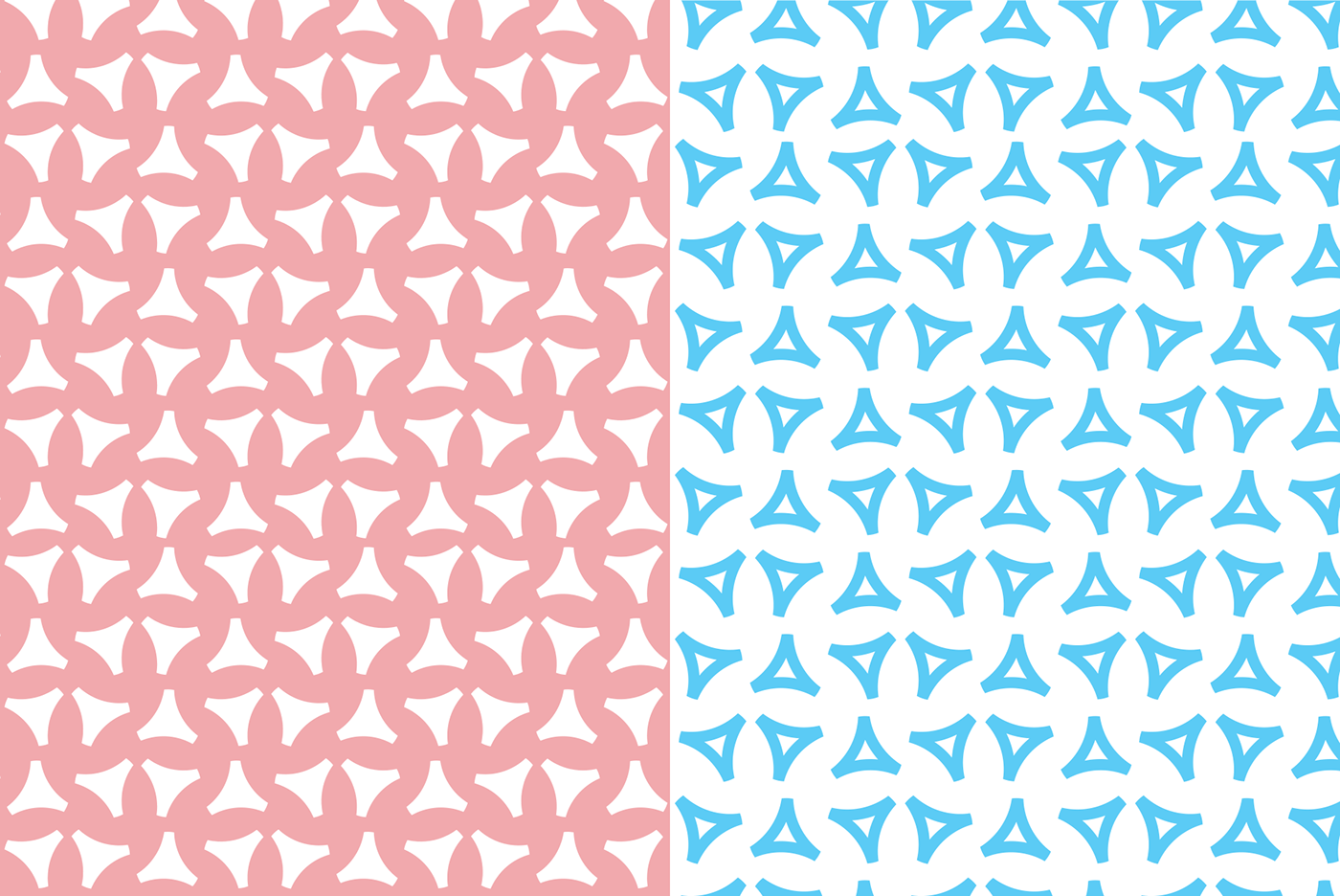
Logo Concept.
Triangle let their viewers perceive them as shapes that are solid and strong, This shape conveys a sense of protectiveness, reliability, and strength. The stability inherent in this particular shape makes it perfect to be used for a petroleum or energy brand.
On the other hand, The Circle expresses a sense of security, continuity, protection, support, and infinity.


Thanks for watching!